Project
AIDN Visual Design
Role
Senior UX/UI Product Designer
Period
2024
UI, interactions, and more — establishing a design system and visual language for AIDN.
Result
Increased productivity and quality of design and front-end development
Feature
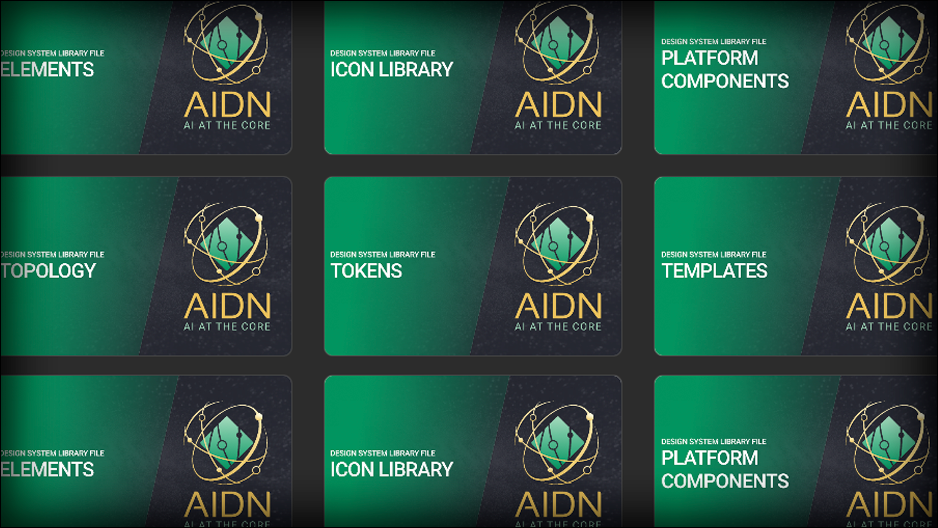
Figma and Design System Documentation Site
Design
Modern and branded "single pane of glass"
Gallery
01
Setting up for Success
It's like setting up your toolbox or palette of paints!
Setting up a Design System allows flexibility when starting a new project — rapid UX exploration, sketching variations, and quick testing of feel and flow. This reduces deadline pressure while improving outcomes.
My Design Systems consist of both Figma Libraries and actual front-end code and components library. This allows for seamless handoff and collaboration with developers, ensuring that designs are implemented accurately and efficiently. The system is documented in a dedicated site that includes usage guidelines, code snippets, and best practices to ensure consistency across the product.
Splitting into layers keeps styles predictable and makes it easy to restyle globally by updating tokens that cascade through elements and components.
- Tokens
- Elements
- Components
- Unique Components
- Icon Library
- Illustration Library
02
For You-ser
Art is an expression of me. Design is what I make for you.
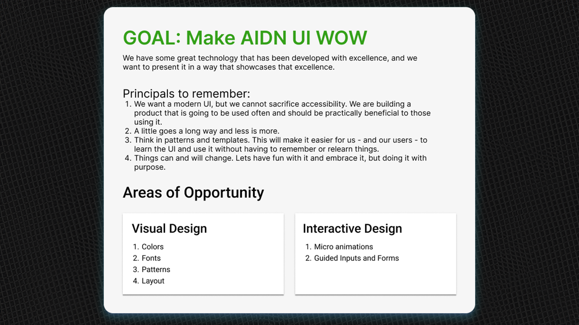
I aim for designs that are pleasing but useful. For AIDN we were replacing existing tools used for long sessions, so considerations like time-to-action, stress levels, and accessibility guided decisions.
I created these guidelines to share with the entire team, none of which are designers. This helps ensure consistency and usability across the board while setting stakeholder expectations.
03
Design Decisions
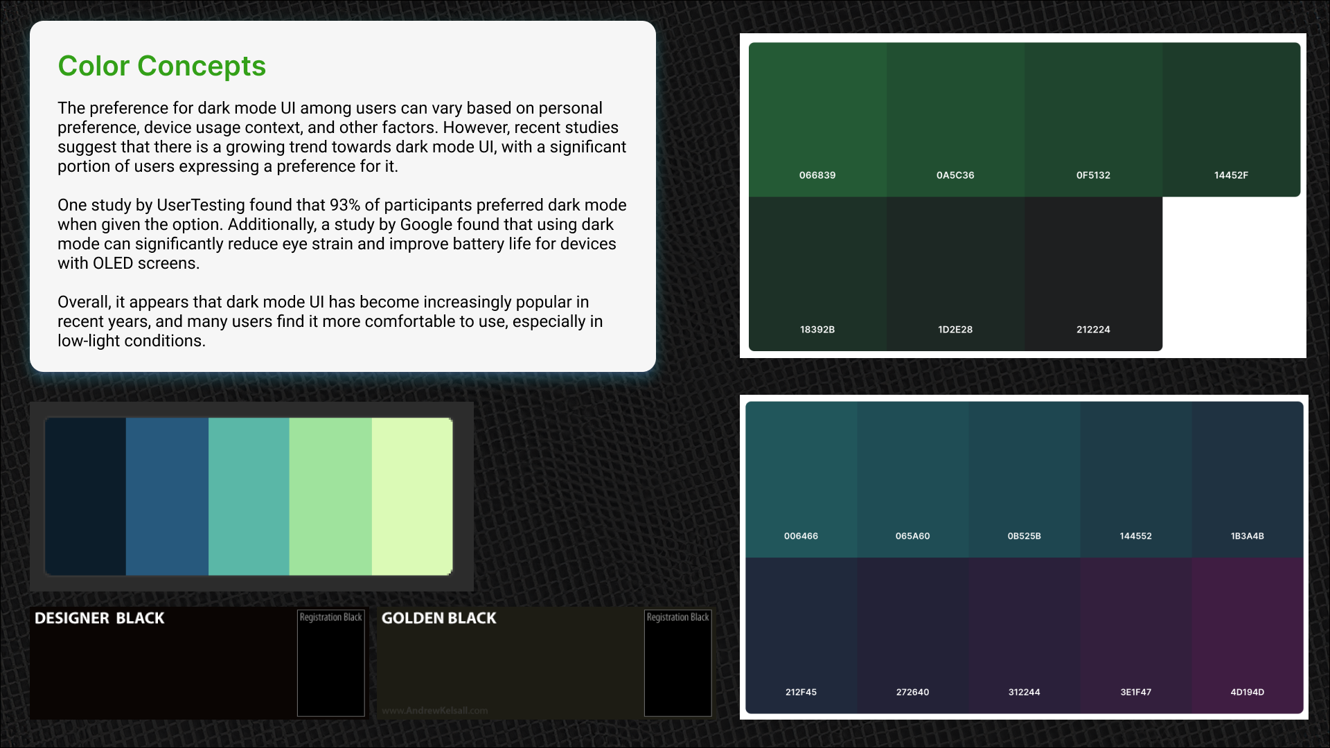
Dark mode was requested and validated by studies — many users work in dim control rooms, so reducing eye strain and fatigue was critical. The brand colors informed the palette, and I chose a green base to feel grounded and practical rather than following the AI-blue cliché.
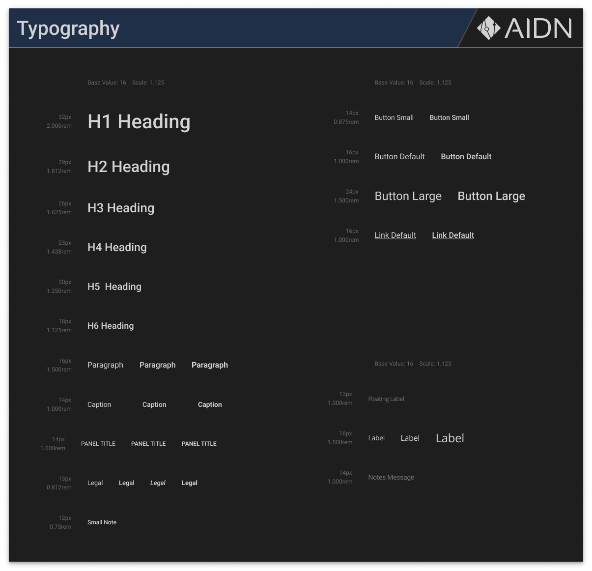
Typography choices were driven by density: an 8px grid baseline and 16px default font-size for legibility. I used a 1.125 Major Second scale for clear hierarchy with modest increments and selected Roboto for a clean, readable sans-serif.
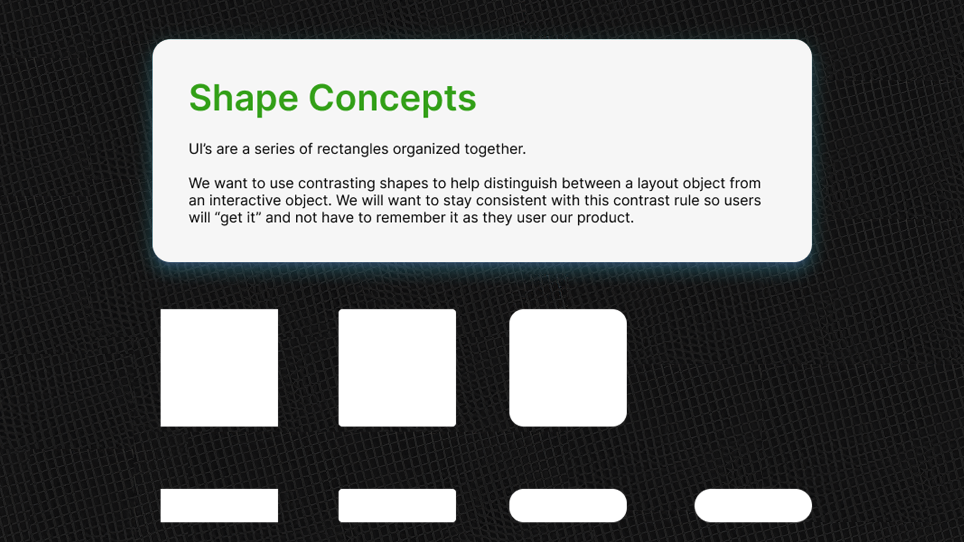
Shape language is critical — a strong foundation lets the design communicate context and brand personality consistently across the system.
For additional brand assets and wider styling notes, see the related AIDN Branding page.